
Morada Flora
A psychology clinic from Brazil focused on well-being and spirituality. The physical space and its services will become reality in a few years, but the company strategy is to start bonding and prospecting future customers in the present. Through free content offered on social media, the firm will have direct interactions with clients from the beginning so it can become a more welcoming space in the future.
The problem
Various channels and profiles focusing on self-help have emerged on social networks due to the difficulties and uncertainties we have been facing lately. Not all available content is based on valid research and studies, though. The objective of this project’s first phase thereby is to offer relevant scientific content created by professionals, but with accessible language and aesthetic appeal.


The process
My role in this project was help to conceptualize and idealize the services from scratch. I was also responsible for the naming, the visual identity, the business card, and special gifts for partners and influencers. After several brainstorming and meetings with the client, I developed concepts that would guide all services and free content provided by the clinic in the near future. These main values helped me to propose ten different names for the startup until the “Morada Flora” was picked.
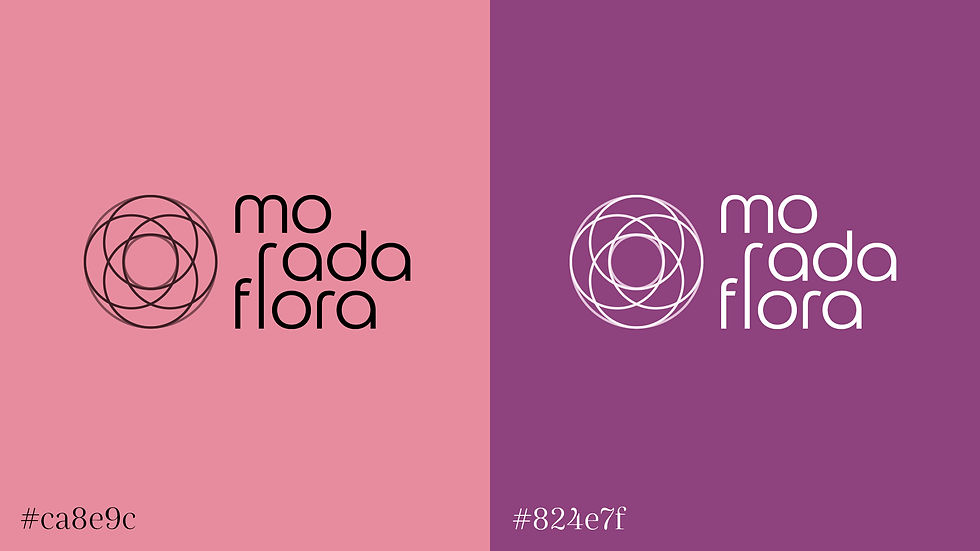
“Balance” and “Life” are some of the concepts defined as relevant for the project. Although pragmatic in some aspects, the clinic is also esoteric and spiritual. For this reason, the brand emerged from a reinterpretation of the flower of life, an enigmatic and perfectly symmetrical symbol considered sacred in several religions that represents the expansion of consciousness.
This “expansion” also appears in the conception of the visual identity. Organic forms inspired by nature were used and they refer to ideas of growth and flourishing. Morada Flora, in Portuguese, means Flora’s Residence, but the sound of it allows an ambiguity that creates the notion of blossom.

The solution
Having the name and concepts chosen, I researched for references and designed options for the brand and its visual identity. With the final proposal approved, I finished the brand’s manual and layout templates for posts and stories. I also provided a business card and a mug to be given as a gift for prospective partners.
This project demanded a plan of continuity. Therefore, I created the templates on Canva (a free platform) so the social media profiles could be cared for by others. However, to avoid misuse of the clinic’s visual identity, I decided to design a small guide where I explained some layout techniques and chromatic applications to ensure the harmony of feeds afterward.


The outcome
The client is extremely satisfied with the aesthetic and conceptual results and has a clearer idea of how to proceed further. The contents are being produced and posted gradually on the clinic’s profile, but disclosure campaigns and engagement strategies will come next. Because of that, it is not possible to effectively measure outcomes yet.
Developing this project, I learned: 1) to become more didactic and objective when dealing with professionals non-related to Design areas; 2) that it is worth empowering customers so they can be more independent, and 3) that creating customer-loyalty can be financially more interesting for me, but it often puts the perpetuation of good results at risk.
MAIN TEAM
-
Copywriter & Supervisor: Maria Luisa Pedrosa
-
Brand & Social Media Designer: Rebeca Gudes